Bisexual Lighting Meaning: What Bisexual Lighting Symbolizes in Our Lives

Image

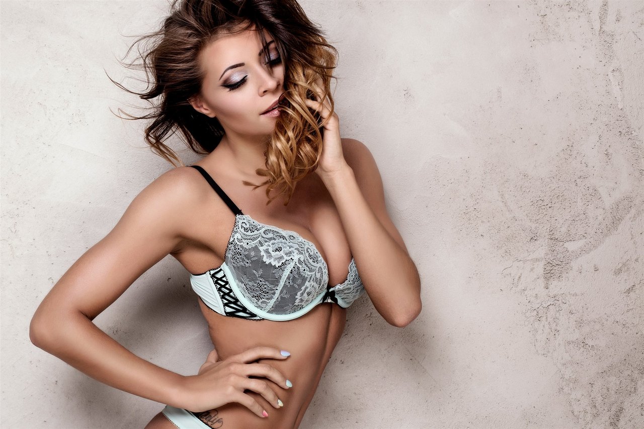
Bisexual Lighting Colors and Symbolism: The Palette of Bisexual Identity

In every major city, you’ll see it—neon pink, blue, and purple glimmering in the dark. These aren’t just pretty lights. This palette represents bisexual lighting, a powerful visual cue. The colors are directly lifted from the bisexual pride flag: pink for same-gender attraction, blue for attraction to different genders, and purple for the blend—where everything merges, where bisexual identity lives. Each color talks to a part of you that may not always find words.

When you see a club bathed in a swirl of indigo, magenta, and electric blue, something shifts. There’s a feeling of being recognized, not just as a face in a crowd but as someone with layers. Everyone deserves a symbol that reflects back their complexity. A simple light can whisper, “You belong.” This is why bisexual lighting isn’t just a trend in pop culture—it’s a statement. It reshapes how we see ourselves and how we’re seen.

In public spaces, the glow acts like a flag made of photons. It invites the bisexual community in, allowing them to move freely and boldly. The colors echo across art installations, festivals, and even social feeds, forming a bridge to visibility. LGBTQ symbolism isn’t just about being seen. It’s about who gets to define what visibility means. Bisexual lighting colors do the work of claiming space, and sometimes, that space is all you need to start feeling real.

Bisexual Lighting Meaning: Why This Visual Language Matters

Visual language sneaks up on you. It’s the meanings you feel before you can speak them out loud. Bisexual lighting meaning isn’t about an official definition. It’s about what happens inside—comfort, pride, relief—when bathed in those neon lights. In LGBTQIA+ culture, bisexual lighting is a kind of unspoken code. It marks films, music, even bedrooms as places where identity expression runs deeper than words.

Representation matters. Neon blue, pink, and purple tell bisexual people, “You’re not invisible.” On social media, the colors are everywhere, saturating TikTok edits and Instagram selfies. Art installations capture the pulse of these hues, turning a wall or a photo into a lighthouse for anyone needing to see themselves reflected. The meaning isn’t fixed; it evolves with every generation. What lit up a film set in 2018 means something different on a Gen Z profile in 2024. Context, audience, and self all play a part.

In the end, bisexual lighting is more than a light show. It’s layered identity, projected into the physical world. It tells a story of presence and possibility that stretches beyond hashtags. To see the spectrum is to see the person—messy, shifting, refusing to be nailed down.

The bisexual pride flag is where the story really begins. It’s bold—pink, purple, blue stripes stacked in solidarity. Designed by Michael Page in 1998, the flag’s split colors speak volumes: pink for homosexual attraction, blue for heterosexual attraction, and purple as the vital blend between. That mix isn’t just color theory—it’s lived experience in visual form.

These hues aren’t trapped on cloth. In pop culture and queer spaces, they seep into club lighting, mood boards, even digital art. Bisexual lighting draws directly from the flag’s palette. Each use makes the message a little louder: bisexual people exist, they shift, and their visibility matters. Lighting becomes a tool—a flashlight, not a spotlight—that gives real-time visibility to those often left in the shadow of binaries.

Symbols do work. They open doors and build bridges. The bisexual flag and its colors have become markers in the world, the same way a rainbow flag marks a parade. Visual cues like these make it easier for people to find each other, to carve out inclusive environments, and to see at a glance: “We’re welcome here.”

The History of Bisexual Lighting: From Online Art to Pop Culture Phenomenon

Rewind to the late 2010s—a digital era hungry for identity, ready to remix anything. That’s when bisexual lighting first started pulsing in online art communities. Social media did what it does best: amplified a whisper into a roar. Suddenly, Tumblr gifs and vaporwave edits were soaked in that unmistakable gradient. History was in the making, but nobody called it that yet.

Pop culture picked up fast. Everything from “Atomic Blonde” to music videos to indie short films leaned into the look—neon-lit, moody, bursting with symbolism. Queer advocacy used these colors to demand more than tolerance: dignity, complexity, and real media presence. The trend didn’t just wander into the mainstream; it kicked the door open. By the time critics started debating bisexual lighting as a trope, bisexual youth had already claimed it as their own code—one part rebellion, one part invitation.

Now you’ll find these colors all over, especially wherever young people gather or scroll. This isn’t just a trend; it’s a chapter in a longer story of LGBTQIA+ struggle and self-affirmation. Sometimes, cultural history looks like flickering RGB bulbs setting the mood for real change.

Image

Bisexual Lighting in Media: Iconic Moments, Impact, and Visibility

You notice it in film stills—the hot pink shadows, the flood of blue and purple. Bisexual lighting in media is deliberate. It’s shorthand. Directors and artists opt for these colors to communicate queerness, even when scripts stay silent. Think of scenes in “Atomic Blonde” or music videos by artists like Janelle Monáe, who use sexuality and lighting together as visual storytelling. These hues give characters and viewers permission to question the edges of identity.

TV has picked up the signal, too. Shows like “Euphoria” or “Sense8” use bisexual lighting to mark intimacy, confusion, or turning points. Social media has accelerated the feedback loop—fans spot and share these visual cues, remix them into memes, collages, and TikTok trends. Representation goes viral.

It matters. When media presence grows for bisexual people, so does the feeling of belonging. Lgbtq symbolism is most powerful when it’s visible to those who need it most and challenging for those who prefer easy categories. Seeing yourself reflected in major cultural moments is not trivial—it’s a validation many had to wait too long for.

Queer Spaces: How Bisexual Lighting Transforms Atmospheres

Walking into a bar, feeling that soft glow—pink here, blue there, everything awash in purple—signals you’re not just in any space. You’re in an inclusive environment. Bisexual lighting reshapes queer spaces, from brick-and-mortar clubs to Discord servers and Instagram stories. Neon lights are more than decor. They create a safety zone, a visual assurance: complexity belongs here.

In both real life and online, these hues help dismantle boundaries. It’s deeper than surface-level trendiness. It’s about atmosphere and unspoken mutual recognition. These are the colors of gathering, celebration, and sometimes, survival.

  • Dance floors or lounges themed with blue-pink LED strips
  • Queer event flyers using the tri-color palette
  • Profile pictures edged in purple gradients on social media
  • Streaming rooms and virtual hangouts mimicking bisexual lighting
  • Pride swag packs with color-coordinated LED accessories

Every item on this list is a small declaration. Together, they stack up until what started as mood lighting becomes a kind of home.

LGBTQIA+ Visibility: How Bisexual Lighting Breaks Through

Visibility isn’t a buzzword—it’s safety. For generations, bisexual people faded in the margins, often misunderstood or dismissed entirely. Bisexual lighting flips the narrative, casting a literal and symbolic light where there used to be only shade. Every instance—on screen, in a club, even in a profile pic—raises the bar for LGBTQIA+ visibility.

The bisexual community needs allies and platforms that don’t just talk about inclusivity, but prove it. Bisexualdating.net exists for this reason. It doesn’t just host a site; it builds a place where bisexual identity is honored and safe. Here, people can present as who they are, not who someone else thinks they should be. The more platforms celebrate bisexuality in word, deed, and visual identity, the less room there is for biphobia.

Pride is earned, not given. Joining inclusive communities like Bisexualdating.net isn’t just about love or dating—it’s about joining a movement where difference is strength, and every color of the flag gets its turn to glow.

Image

LGBTQ Symbolism: The Language of Colors in Queer Identity

Symbolism is a tool that carves new meanings from old materials. Bisexual lighting fits inside a larger visual language that LGBTQ people have built over decades—every flag, every glittering sticker, every wearable pin. Still, bisexual lighting stands out. Where rainbow flags broadcast solidarity, the pink, purple, and blue stripes whisper nuance; they mark identity with specifics.

Other pride symbols have their moment, but bisexual lighting stays flexible, adapting to art installations, events, even app UI design. Artists and designers tap into color theory to make sure these symbols aren’t just pretty—they’re powerful. The colors are more than pigment. They’re a promise that identity is allowed to be complicated.

New expressions keep emerging: gradients and color overlays on profile pictures, interactive light sculptures at festivals, even virtual reality worlds coded in bisexual hues. As digital culture shifts, LGBTQ symbolism will keep adapting, making sure nobody looking for themselves has to look in vain.

Bisexual Youth and the Power of Visual Identity

Digital-first generations recognize a symbol before they hear an explanation. Bisexual lighting resonates with bisexual youth because it’s self-expressive and easy to share, online or offline. TikTok trends, Instagram filters, and Snapchat lenses all harness these colors to signal identity, connect with peers, and—sometimes—find safety in numbers.

For a lot of young people, representation isn’t a goal, it’s the air they want to breathe. Their feeds overflow with images lit in pink, blue, and purple, forming a kind of ongoing conversation about who they are, what they want, and who they might become. These signals aren’t just aesthetic—they’re anchors in youth subculture.

Social media has democratized visibility, letting bisexual youth bring bisexual lighting into their bedrooms, parties, and blog posts. In doing so, the lights become a shared language, a low-threshold way to say: “You’re seen, even if you don’t want to shout.” The impact is lasting—a generation feeling less alone, one filter at a time.

Bisexual Lighting Home: Creating Your Own Inclusive Space

Personalizing a space means crafting it to reflect who you are. Achieving bisexual lighting at home is simpler than you might think. You just need the right mood and the right tools. Try LED strips, colored light bulbs, or even smart lamps to build your color zone. Placement is everything. Set lights along the ceiling, behind your headboard, or to spotlight art—anywhere you want to feel most like yourself.

  • Choose adjustable color LED bulbs or strips for flexibility
  • Mix blue, pink, and purple in overlapping or adjacent placements
  • Use smart controls to switch moods for socializing or relaxing
  • Accent areas that matter—reading nooks, mirrors, wall art
  • Set up mini light installations for pride events or personal milestones
  • Opt for energy-efficient models to keep things sustainable

When light reflects your real story, home stops being just shelter. It becomes a safe place for personal identity to dwell—and for pride to land, softly, on every wall.